
Lab 2.1
- Map Projections (US)
Time for completion: ~ 4 hours
Part 2 - Distorting
the World
Purpose
For Part 1 we will be assessing map projection differences for the Conterminous US. We will be creating a map layout with multiple data frames in it (four maps in one page), and we will be creating a new shapefile (a data layer with a line in it connection two points). Aside from subtle visual alignment differences, each projection's distances and areas will be different. We are going to make a line linking two points on either side of the country, and then "calculate" the real world length of that line. We will be comparing the aerial differences by "calculating" the area of the US and a shape that you will be creating.Overview
Geospatial data are encoded with certain units, the spatial components of each feature (lines, points) are projected using a mathematically defined coordinate system transformation. The earth is round and maps are flat, map projections flatten the round earth. ArcGIS recognizes a bewildering number of projections and coordinate systems, but in practice only a limited subset of these are used. ArcGIS has attempted to remedy problems associated with dealing with projections with "projections on the fly". Essentially ArcGIS will try to recognize what projection your data have, if this information is not already explicitly defined (the .prj component of the shapefile contains this information), and then open them in ArcMap. Sometimes this works, sometimes it doesn't.
When you add data to ArcMap it is contained in a Data Frame. Recall from the first lab that there are two view options in ArcMap, one is Data View and the other is Layout View. When you are in Layout View you can see the Data Frame that contains your data, think of this like a window on your data. You can resize it, move it, and add other data frames to the same map layout. You can also change the projection of the data frame but this does not change the actual projected units of the lines, points, it only changes the projection that you are viewing the data with.
The data from TemplateData you are using are all projected with the "Geographic" projection (which isn't technically a projection, its a coordinate system). Geographic units, the Map Units, are latitude longitude (degrees, minutes, seconds, or decimal degrees etc.), these are spherical coordinates. You can change the Display Units to whatever you want, but you need to reproject these data to change the Map Units. All projection operations are based on spherical coordinates. If, however, you wish to calculate an area, or determine a precise distance, this is not an appropriate coordinate system. You need planar coordinates to do this. Square degrees are meaningless, and for most people a distance specified in degrees is also meaningless.
Note: In the screenshot images below you will see "lab4", this is now "projection_lab"
Create a new folder called "projection_lab". Download and unzip [this file] into the projection_lab folder, use the Extract button to maintain the file structure. This should create a folder in projection_lab called projection_lab_data (the "path" to the data will be C:\WorkSpace\projection_lab\projection_lab_data\). Notice there are no spaces.
Windows Explorer by default views files and folders as miniature pictures (icons), this might be a good way to look at pictures but its not very useful otherwise. Go to the projection_lab_data folder you created using Windows Explorer. In Windows Explorer go up to View -> Details to make Windows Explorer list the contents of the folder. In the Options dialog go to the View tab, and uncheck Hide extensions for known file types, check on Show hidden files and folders, and Check on both of the Display full path boxes. Click the Apply to All Folders button at the top, then click Apply (ignore all warning messages if there are any), and finally click OK.

To change Windows Explorer's default way of displaying the contents of folders (make it remember to display it this way) go to Tools -> Folder Options and click Apply to All Folders (2), then click Apply (3) and finally click OK (4) to close this dialog box. Windows explorer should now remember these View options, but depending on how the account you are using to log in to this computer is configured you might have to do this again.
Step 1.2 - Open the ArcGIS data folder, and look at a shapefile
ArcGIS has its own data stored in C:\Program Files\ArcGIS\Bin\TemplateData\. Use Windows Explorer to find this folder, there are two ways to get there. 1) you can click your way to it or 2) you can copy-paste the path (C:\ ...) from into the Address bar (option 2 is much faster). This data is used for the predefined map templates which you will be using at the end of this lab to create a map. Once you're there go into the USA folder. In the USA folder you can see files listed with their extensions.

In the screenshot above you see a bunch of files all with the name "cities" but with different extensions, these files collectively are what constitute the shapefile called cities. Now start ArcCatalog and connect to this same folder. Again, copy-pasting the path is much faster, but you can click your way to it if that is the way you prefer.

In ArcCatalog you see only one file representing the cities dataset, the shapefile (.shp), and its icon has dots indicating it is contains points. ArcCatalog internally stores the linkages between all these files so you only have to work with one. Simplicity is good in some cases, but now you know shapefile data are stored as separate files. For now we are not going to concern ourselves with what each of these files are, just know that a shapefile is not just one file but with ArcCatalog you can treat it like one single file.
Connect to the projection_lab folder in ArcCatalog, you may also want to Connect to the TemplateData folder as well.
Question |
Open ArcMap with a new empty map and drag the cities.shp file from from ArcCatalog into the empty ArcMap layout. After you have cities.shp in ArcMap, push the Add Data button and add USA_48 from the projection_lab_data folder. What does ArcMap say?

This warning message means that ArcGIS has detected that there is a difference between the projection as it has been defined for the first dataset you added (cities.shp from the TemplateData folder), and USA_48.shp which you got from the zip file. Generally it is fine to click OK, but sometimes errors occur due to projection differences.
Note that in the middle of USA_48 there is a funny shape. This is referred to as the test-shape, it looks like a sideways ice-cream cone. The test shape will help you visualize the results of different projections. Both the roundness and the direction it points will change depending on the projection.
Put USA_48 underneath cities. Next we are going to make a new shapefile with two points representing the opposite coasts. In ArcMap go up to Selection -> Select By Attributes. In the Select By Attributes dialog set the Layer to cities, and make a query for: "select the points from the cities shapefile with the names New York or Los Angeles".
The syntax of queries is very specific because they can get rather complicated. Notice the use of the brackets, and single vs. double quotes in the screenshot below. You can type the city names or select them from the right hand side, to do this highlight the Field (CITY_NAME), the click the Get Unique Values button on the right. Or you could be lazy like me and just copy-paste this: ( "CITY_NAME" = 'New York' ) OR ( "CITY_NAME" = 'Los Angeles' ). Click Apply when the query is complete and then Close.

If the query worked the two points should be highlighted in cyan (like the screenshot below). Make a new shapefile with only these two selected points (NY and LA), right-click on the cities layer and go to Data -> Export Data.

In the Saving Data dialog that opens check to see that the Export field is set to Selected features (as is shown below), then click on the folder button next to the Output shapefile or feature class. In the Saving Data dialog box that opens find your way to the projection_lab_data folder (if you used the Connect feature in ArcCatalog this path will be available from the pulldown menu). Name the new shapefile "TWOCITY.shp" and click Save, and the Yes to add it to ArcMap.

Does what you just did make sense? If not ask me, this is the simple way to create a new shapefile (from an already existing shapefile). The next step shows another way that is a little more complicated.
Right-click on the original cities layer in ArcMap and Remove it. Click the Zoom to full extent button so the Conterminous US fills the ArcMap window, and you can see the two points against the USA_48 background.
Question |
In order to find the distance between LA and NY it is simply a matter of selecting the Measure distance tool and click on one point and then the other, but in order to determine the distance between these two cities with enough precision so as to compare different map projections we need to connect them exactly by snapping a line between them.
To create an empty shapefile that will hold lines start ArcToolbox and go to Data Management Tools -> Feature class -> Create Feature Class.
In the Create Feature Class dialog set the output location as projection_lab_data, this might be a tricky. To do this you need tell ArcToolbox where to write the shapefile (the path to your data folder). Click on the folder button and get the Output Location dialog to show the projection_lab_data folder. Click once to highlight the projection_lab_data folder (but don't go in to it) and click Add. Next, in the Create Feature Dataset dialog, name the new shapefile "la_to_ny_lne" and be sure that Geometry Type is set to POLYLINE (not POLYGON). Click the Spatial Reference button, and in the Spatial Reference Properties dialog that opens click Import ... then highlight the twocity shapefile and click Add, then Apply, then OK and OK again. The new, empty, shapefile will automatically be added to the ArcMap layout.

The Import button for defining projection works well, you can copy the project of another dataset so long as the projection is defined. For USA_48 the projection is not defined, but for TWOCITY it is.
This may seem like an excessive amount of effort to just make a line, and it is, but what you have to keep in mind how complicated the software you are using is. How spatial data are created, modified and organized with ArcGIS9 depends on this type of compartmentalization of functions (i.e. Projection Tools). It is a pain in the ars to do simple things, but this permits a greater diversity of functionality ... welcome to the Microsoft of GIS. Trust me, the more you do it the faster you get, things will start to make sense once you get a feel for how some of these buttons and pulldown menus work.
Step 3 - Assign projection (with ArcToolbox)
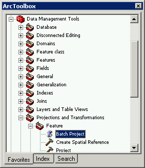
A dialog will open that allows for multiple inputs ("batch processing"). If you ever find yourself faced with having to do the same thing over-and-over again, look for a way to do it as a batch file (or script). The time you spend figuring it out will be worth it, especially if you have to do it again some day (provided of course that you remember how to do it when that time comes).
Add the three shapefiles to the Batch Project dialog using the folder button to the right of Input Feature Class or Dataset at the top.
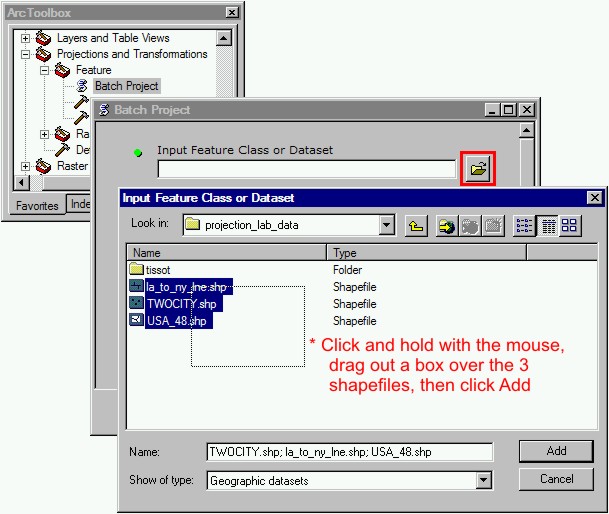
Next specify the Output Workspace (the folder to write the projected datasets to). To do this you need to click the folder (but not open the folder) where your projected data are. To set the Output Workspace you need to go up one level from where you are (click the yellow up arrow button), then highlight the projection_lab_data folder and click Add.

After you've set the Output Workspace to C:\WorkSpace\projection_lab\projection_lab_data, click the icon next to the Output Coordinate System. In the dialog that opens click Select this time, then go to Geographic Coordinate Systems -> North America, and choose North American Datum 1983.prj (NAD83). Click Add, then click Apply and then OK, and then OK again to run the batch projection.

Click Close when it is done. Now you have defined the projection for the datasets. Thankfully all three have compatible datums, but what about USA_48? Was it NAD83? hmm mm. Lets just assume it did for now. If they did not, or we couldn't just assume they did, we would have another problem to deal with (datum conversion). Nightmare, lets just move on.
Close ArcMap, there is no need to save this layout.
Question |
ArcGIS in the process of doing the Batch Project created copies of the datasets with "_shp.shp" on the end. One issue with ArcGIS is that it generates files like crazy. Any transformation procedure, such as what you have just done, generates files and this can become a real mess if you don't keep track of your project data as you go. These labs, as you will soon notice, put a premium on staying organized.
Open ArcCatalog and go to the projection_lab_data folder. You see the original shapefile and the projected shapefile with _shp on the end. The files with _shp on the end are the ones we want to keep, the rest are trash. Select these, right-click and Delete them.

Next I want you to rename each of the three shapefiles so they have "_ll.shp" on the end (for latitude/longitude, geography) instead of "_shp.shp" To do this right-click on the shapefile in ArcCatalog, choose Rename.

This house keeping stuff and consistently naming files is an important habit and getting used to cleaning-up as you do things helps.
Start ArcMap again and make a new ArcMap Layout with the three _ll.shp projected datasets, note that this time ArcMap did not bark at you with a Warning about incompatible projections. ArcGIS has read the .prj files for each shapefile and now believes that all three shapefiles are exactly the same projection. ArcMap is happy.
Step 4 - Changing how the map looks
Step 4.1 - Symbology, Contrasting Colors
You will be printing (or exporting) the map you make for Part 1 eventually, as well as the four maps you will create in Part 2 in Grayscale, so contrast is all that is important but you can noodle with the colors if you want to.
Change the color of the states to a lighter color. Right-click on the USA_48 data, and choose Properties then open the Symbology tab. Under Categories, choose "Unique values". In the pulldown menu under Value Field choose STATE_ABBR. Click the Add Values ... button at the bottom. The test-shape's STATE_ABBR attribute has been assigned ZZ, select it from the list and click OK. Double-click on it, and make it darker than the rest. <all other values> are the states, change them to a lighter color than the test shape. Click Apply, then click OK.
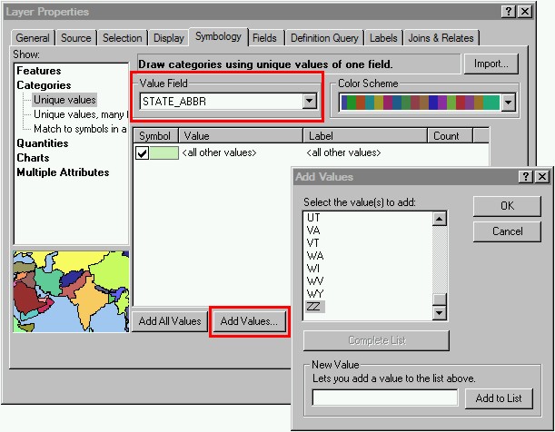
I used a light shade of gray for the states <all other values> and a dark gray for the test shape, you can choose to use color if you want so long as they contrast.
Change the data frame's map units, at the top of ArcMap go up to View -> Data Frame Properties and under the General tab set Units -> Display to Miles (or Kilometers). Notice that you cannot change Map Units. This is the unit that ArcMap will use to measure distances (i.e. with the ruler tool) and to create a scalebar linked to the data frame's coordinate system. Display units can be whatever you want, but the Map units are those of the data's projected units (the units that the actual data are encoded with). Important concept to grasp.

After you change the Display units, go up to File -> Page and Print Setup, change the page alignment from Portrait to Landscape.
In ArcMap switch from Data View to Layout View (under the View menu at the top, on the little globe vs. paper buttons in the bottom right of the display window). Warning: getting used to navigating in Layout View is frustrating. There are two toolbars, one works for Map View and the other for Layout View. PLEASE ASK FOR HELP if you get messed-up with this part, I can help you learn them (or, of course, you can bash your head against the monitor until you learn them on your own).
Use guides (dashed lines across the window, turn them in Layout View using View -> Rulers, Guides, etc.), first put guides one quarter inch in on all sides (click on the ruler guide on the edge of the window and the appropriate dash). Next, Divine the page into quarters, because you have .25" in on either side, what is the center of the page now? 5". Insert two scalebars, scales usually have round even numbers. Make one scalebar Metric units, and one scalebar English units. Insert a text scale too (use the Absolute 1:1,000,000 RF style), his will not have nice round numbers because it is linked to the extent of the data shown in the data frame. Arrange the first Data Frame (the bashed rectangle containing your data visible in Layout View) so that it takes-up about a quarter of the page.

After you get though noodling with the positioning of the scale references and the data frame, go up to File -> Map Properties and change Data Source Options to "Store relative path names" and save this map layout.
Question |
A graticule consists of meridians and parallels. Add a graticule that has 15 degree spacing along the x-axis (meridians) and 10 degree spacing along the y-axis (parallels).
To do this go to View -> Data Frame Properties. Select the Grid tab in the dialog, there should be no graticule defined because we started from an empty map. Click Next and take the default intervals (10 and 10). Click the Style button to change the line, make it lighter and choose a thin dashed line style.

After you specified the internal and changed the line style to be lighter gray and dashed, click Next. Uncheck both Major division ticks and Minor division ticks, then change the Text style to No Color (as shown in the screenshot below). Then click Next and Next again, the Apply and the OK.

The graticule will be visible only as simple gray lines, this is nothing more than a reference. At the size of this page, 8.5 x 11" a graticule would not serve the purpose if it were cluttered with tic marks and text, a simple grid will enable you to see (at this page size) the differences in the geometry. You can only see the graticule in Layout View.
Rename this data frame layer name to in ArcMap to "Geographic". You should now have something that looks like the following.

Had enough of Layout View yet? Probably. Save the map layout and switch back to Map View.
Question |
Step 5 - Snap a line connecting points
Now we're going to add one line to the empty la_to_ny_lne shapefile we created. This line will connect the two points in TWOCITY. Instead of eyeballing it, we're going to make it match these two points exactly by snapping the nodes (start-end points of the line) to the points. In ArcMap under Tools -> Extensions make sure that Spatial Analyst is checked on. Go up to View -> Toolbars and check the Editor toolbar on. Go up to the Editor pulldown menu (that is part of the Editor toolbar you just turned on) and select Start Editing.
ArcMap will bark at you about the coordinate system for the data frame not be set to the same as the data it contains. This you can ignore; check the box "Don't warn me again", then click Star Editing.

Snapping ... (its is towards the bottom of the list).
As shown below, check the box in the Vertex column next to TWOCITY (the shapefile we want our line to snap to)


Before we draw the line we need to specify the type of line feature we want to add. Next to the Task field along the top, pull down and select "Create 2-Point Line Features". Also, make sure the Target field is set to la_to_ny_lne.

Now, at last, we are ready to draw the line. Click the pencil tool. With the cursor move it over the point that represents LA, notice that it turns red (this is the snapping setting showing you the feature the line will snap to). Click once on LA, this will add a "start node" representing the beginning of the line. Then go over to the NY point and double-click quickly, this will add an "end note" representing the end of the line. Go back up to Editor and choose Stop Editing, and click Yes to Save Edits.

Anti-climactic wasn't it? All that just to create a shapefile, project it, and add a line. There are other ways to do this, but some of the procedures you have just performed and tools will be helpful with other things later on. You are building-up a little "how to" list of things that you will later be able to draw upon for other tasks.
Question |
Step 6 - Reprojecting shapefiles
We used ArcToolbox's Batch Project to define the projection of each of the three datasets we are using (USA_48, la_to_ny_lne, TWOCITY) as Geographic., these three projected datasets are in the first data layer. But you did not change the coordinate system of the data frame, only defined the coordinate system of the data. You are going to add three more data frames, the three data frames will each contain data with a different projection.
It is important to realize at this point that there are two facets to ArcMap, what you see (Display) and the actual datasets (the shapefiles). Manipulating display units is different than transforming between projected coordinate systems. Select the Geographic data frame, right-click and choose Copy, then right click in the white area of the map and choose Paste.

Position the data frame in the second quadrant, it should snap in cleanly with the guidelines.

Paste the copied data frame two more times so all four quadrants have data frames (but only one will have graphical/text scales). Select the top-right data frame and move on to the next part were you will be reprojecting these shapefiles.

All the layers contained within the New Data Frame you just copied will be projected by changing the projection of the data frame. Think of the data frame like a window on your data, although the shapefiles are all geographic (with decimal degree units) you can change how the are displayed to any projection or measuring unit. To change the actual units that the data are encoded with and their projection requires that we create a new shapefile.
Step 6.1.1 - Reproject to Albers
To change the projection of this New Data Frame (and the how the data in that Data Frame will be displayed) go up to View -> Data Frame Properties, click on the Coordinate System tab to view the projection. Choose a projection from those that are predefined (press the plus sign next to Predefined folder in the coordinate system window), go to Projected Coordinate Systems. In the Continental subgroup choose North America.

Choose a projection for USA, USA Contiguous Albers is good to start with, and click Apply. Don’t worry about the warning window that pops-up (twice!).

Change the units that are displayed (in the General tab of the same dialog), Miles, or whatever unit you want. Select the General tab from the Data Frames Property dialog and changing Display units.
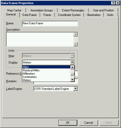
Notice that the Map Units are now Meters (they are dimmed, and in the field directly above the Display units you just changed). You can use kilometers, or nautical miles, or whatever unit you want for the Display units. The effect of this is to change the change the scalebar's units or the measurement tools units (the displayed units in other words). We only need one of our inset maps to have graphical/text scales because this will not change (the extent for each of the four data frames for the final map will be exactly the same).
In order to set the projection permanently we need to export the newly projected data. Right-click on each of the three layers in the projected data frame and do Data -> Export Data ...
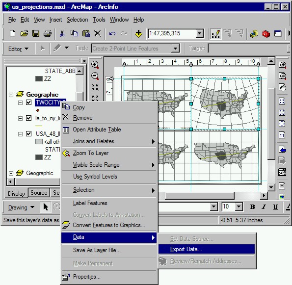
Name each layer with its original name but "_alb" on the end to denote its projection. You are going to create three new datasets from the original three, TWOCITY_alb, la_to_ny_lne_alb and USA_48_alb.
Important Step: In the Export Data dialog, choose "the data frame", and put in the appropriate name. Click Yes when asked if you want to add it this data frame after export each of the three shapefiles.


Remove the original Geographic datasets (right-click, Remote) so only the _alb shapefiles are in this data frame now. Rename this data frame Albers. Select the next data frame, the one in the lower left.
With the next data frame selected go up to View -> Data Frame Properties, click on the Coordinate System tab to change the projection.
This time choose USA Lambert. Click Apply and OK, ignore the warning messages.
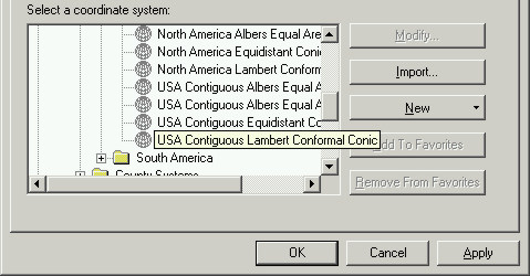
Once you have the New Data Frame set with Lambert projection, do Data -> Export Data and (Important Step) select "the data frame", and put "_lam" at the end of each of the three new shapefiles you are creating.
Click Yes when asked if you want to add it this data frame.


Rename this data frame "USA Lambert", and remove the original Geographic datasets so only the _lam shapefiles are in this layer. Select the last data frame.
In the last data frame repeat the procedure you've used for the last two.
At this point you should have four data frames in your map, three of which contain data with a different projection. It is important that when you to Data -> Export Data ... that you selected "the data frame" in the Export Data dialog. Doing this has permanently assigned the data a projected coordinate system and the planar units (Map units) will be meters. You can make sure each data frame shows the same extent by selecting it and clicking the Zoom to Full Extent button.

The symbology should be identical for each data frame, you might want to change the symbology of the lines and points, but this is optional. Change the symbology for the three new data frames, make the states contrast with the test shape as you did for the first data frame. You might want to change the Symbology for the line and two points as well to make sure they show-up, but this is optional.
Question |
There are three statistics I would like you to get in order to assess the three projected coordinate systems: 1) the length of the line, 2) the area of the test-shape, and 3) the area of the conterminous US (not including the test-test shape). In order to get these stats you will need to update the Attribute Tables for each of the datasets. The Map units of the Geographic coordinate system data frame are decimal degrees (dd), these units are not based on planar coordinates.
The projected datasets (*_alb, *_lam, *_equ) have meter units, and are projected in three different planar coordinate systems. We need to get the statistics from each of these datasets, the attributes of each (Length and Area) are stored in a separate table (an Attribute Table) that is part of each shapefile.
From ArcGis Desktop Help for "length, calculating for lines"
1. Right-click on the layer you want to edit (the "la_to_ny_lne_alb" shapefile in the USA Albers data frame) and click Open Attribute Table.
There is no field for the length values, add a new field for Length by clicking the Options button and selecting Add Field.
After you've entered Length in to the Name field, Select Long Integer (big number) as the Type. We need to make this field accept large numbers (Long Integer) because the Map units are in meters and the Area and Length continental datasets will be HUGE numbers!

2. Right-click on the Length column heading and choose Calculate Values. Click Yes if it barks at you.

3. In the Field Calculator dialog, show below, check on Advanced. Highlight Length in the top window, and then copy-paste the following VBA statement in the bottom window.
Dim dblLength as double
Dim pCurve as ICurve
Set pCurve = [shape]
dblLength = pCurve.Length
Copy-paste the variable "dblLength" in the text box directly under the "Length =" at the bottom as show below.
4. Click Save, keep this script somewhere convenient so you can find it again and just use Load to put it in again, name it "calclength". Click OK to run it.

The number you get in the Length column of the Attribute Table is the length of the line. "Map units" are fixed by the coordinate system of the data, in this case the units are (Albers) meters. Record this number, the length of line stored in the la_to_ny_lne_alb shapefile.
Calculate the Area column for USA_48_alb
From the ArcGIS Desktop Help for "area, calculating for polygons":
1. Right-click the shapefile layer you want to edit (USA_48) and click Open Attribute Table.
You do not need to add an field for Area, it is already there. The reason you had to add the Length field for the la_to_ny_lne shapefile is because we created that shapefile using ArcToolbox and it had not attributes.
2. Right-click the field heading Area and click Calculate Values.
3. Check Advanced.
Copy-paste the following VBA statement in the first text box:
Dim dblArea as double
Dim pArea as IArea
Set pArea = [shape]
dblArea = pArea.area
Put the variable "dblArea" in the text box directly under the area field name.
4. Click Save and save this script somewhere, call it areacalc.cal, click OK.

Again, if when you did Data -> Export Data you did not select "the data frame" the length you get will be that of the original geographic coordinate system (45). Square degrees is a meaningless number! Redo the Data -> Export Data ...
This is simple to fix, just go back to that data frame and do Data -> Export Data again. Make sure that select "the data frame" is checked on (but make sure the new export is added to the correct data frame and named correctly)
Repeat these two procedures for the other two projected shapefiles (*_lam, *_equ), you can use your saved VB Code to make the process a little faster
So far you have updated the Attribute Tables of the projected datasets, and you have the areas in square meters and lengths in meters for each of the three datasets in each o the three Data Frames (you have nine new datasets, nine attribute tables). Getting the statistics from an attribute table is a two step process.
1) Right-click on USA_48_alb in the first projected data frame, USA Albers, in the left side of ArcMap, Choose Open Attribute Table. Next, right-click on the Area column heading in the Attribute table and choose Summarize ... (if for some reason ArcMap squawks and won't let you do this, you might still be in Edit mode, you need to do Stop Editing)
In the Summarize dialog, check the First box under STATE_ABBR. Name the output dbf file (dBASE spreadsheet) with "alb_area_" at the beginning. Click NO when asked if you want to add the table to the map.
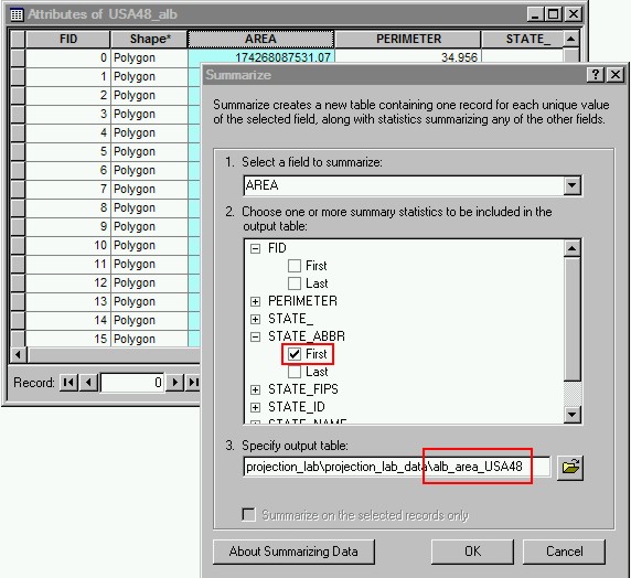
You need to get two statistics, one is the area of the test shape and the other is the summed area of all the states. Remember that if you are using a linear unit conversion that area is squared. You could trouble yourself with the arithmetic of unit conversions on paper, use a an online unit converter (the link listed below uses very precise conversions), OR, better yet, use the CONVERT function in Excel. Your choice.
NODC Unit Conversion Guide - http://www.nodc.noaa.gov/dsdt/ucg/
Question |
Step 8 - Fix-up the final map, export a jpg
Map 1 requirements: 1) Use four different coordinate systems, four maps on the same page of the Conterminous US, LA and NY, the line connecting them, and the test-shape. 2) A scalebar and numerical scale on the unprojected Geographic map (the extent of each map will be identical), 3) add a title for each map (maybe its projection), and a title for the whole map (maybe Distortions of the US or something like that). 3) Include somehow the length of the line connecting the two cities for the three projected coordinate systems, and the area of the test-shape. Include this on each of the three projected data frames within the map's frame. Small fonts are fine, but don't go below 6 (that's too small)
You could try to print directly from ArcMap. This can be a memory intensive operation for the computer, and for the printer. Just export an image file and email that to me. To export and image go to File -> Export Map. Name the map, choose jpg as the type and set it to about 150-200 dpi (to see this option click the little diamond next to Options).Then click Save (it should be aligned Landscape, you changed this early on with File - > Print Setup)

For the write-up you will need the length in miles and meters, and the area in square kilometers, square miles, hectares and acres, for the test-shape and the Conterminous US. Use Excel's CONVERT function. Below is an example of what your spreadsheet could look, but I will leave this arrangement up to you because I know there are some Excel Artists out there who have some serious skills.

The deliverable for this lab (Lab 2.1, Projections of the US) are 1) your final map, as a separate .jpg attached to an email (also attach you .mxd file), 2) the answers to the questions in the form of a word document (including the jpg map inserted), and 3) the summarized nice-and-neat Excel file showing the areas/lengths for each of the three projected shapefiles with all of the conversions requested.
The End