Lab 2.2 - Map Projections (World)
Time for completion: ~ 4 hours

Part 1 - Distorting the US

Part 2 - Distorting the World

2.1 - World Map Template
1.1 - Clean-up the template
1.2 - Change the layers
1.3 - Change the graticule
1.4 - Modify the map, add Tissots
1.5 - Save the final map, export a jpg
2.2 - Make a Map of N/S America
2.1 - Use an Orthographic Projection
2.2 - Query to change Displayed Features
2.3 - Add a graticule
2.4 - Add labels, finalize the map
2.3 - Make Your Own Map
3.1 - Connect to Geography Network
3.2 - Expectations for your first map
2.4 - Deliverables for Lab 2.2


Purpose

Small scale maps make the effect of different projected coordinate systems visually apparent. Some projections are better suited for certain purposes, and some look really funky. The purpose of Lab 2.2 is look at different projections, and familiarize yourself with the elegant simplicity of different approaches to "flattening the earth". To aid with the visual interpretation of the distortion of shape and area we will be using Tissot's indicatrix for Part 1. It consists of circles that are 5 degrees in diameter that are spaced 30 degrees apart.

I encourage you to explore different projections, ArcGIS has a lot of them, and develop some knowledge of them on your own. Some projections, such as those you worked with in Lab 2.1 for the Conterminous US, are common and there are a few global scale projections that are common as well but there are also some that are not that common. Good general purpose references for information about projections are The Geographer's Craft website compiled by Peter H. Dana, Map Projection Overview, and Map Projection Pages from 3DSoftware.com

Part 2.1 - Use a Template

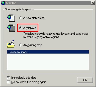
We are going to make three separate maps showing different projections, each on one page rather than four inset data frames as you made in Lab 2.1. Begin by opening a new layout in ArcMap, this time load one of the predefined map templates. Note: If, for some reason, the dialog shown in the screenshot below does not open when you start ArcMap it can be opened using File -> New in ArcMap.
After you click OK a new dialog will open asking you to choose a template. Under the World tab, choose World Mollweide. This will automatically load a graticule, reference lines, place names, country boundaries and collar information.

This template is pretty, but most of the clutter on it does not serve our purpose. Simple is best for these maps.

Start ArcCatalog and Connect to the TemplateData folder (C:\Program Files\ArcGIS\Bin\TemplateData\)

Step 2.1.1 - Clean-up and customize the template's layout symbolization

Remove the Lakes, Rivers and Ocean data layers from the ArcMap layout.

You know how to switch between Map View and Layout View. Note that in Layout View the graticule is visible, in Map View it is not.

Question
1. What are the Display Units, Map Units and Datum of the default Mollweide map layout data frame?

Step 2.1.2 - Change the layers

Open the Symbology for the "Geogrid" layer (double-click, or right-click choose Properties -> Symbology). In Symbology select NAME as the Value Field, then click the Add Values button. Choose only Antartic-Artic Circle, Tropics of Capricorn-Cancer. Then, with these select, click OK and then uncheck <all other lines>

As you are not going to be printing this in color, reset each line's color to black. In the Symbology dialog you can select all the lines, right-click and choose Properties for All Layers ... If you want to experiment you can choose different line styles, dash's, etc. You may have to adjust the line thickness (0.4, 0.8 is the real range for most maps, for posters sizes the line thickness are different). For now, once you have changed the lines to black dashed lines, click Apply. You can come back to this later.

Change the Cities layer so that those with more than three million are displayed. To do this look at the Properties dialog again, look under the Definition Query tab.

Change the label for this layer in ArcMap so it is > 3 million (not > 5 million). You may have to click the refresh button in the ArcMap display (in the lower left, beside the buttons to switch between Map View and Layout View) to get the cities to change.

Next change the Symbology of the County Boundary layer so the outline is light gray and the fill is two shades darker gray.

Switch to Layout View, if you are in Map View.

Question
2a. What is the X and Y spacing of the graticule for this predefined World template?

2b. Use the ruler tool to estimate the width and height of the globe, once using the default Display Units and again using Kilometers. (use Layout View)

Step 2.1.3 - Modify the graticule

Open the Data Frame Properties (View -> Data Frame Properties), and open the Grid tab. Click Properties, in the Reference System Properties that opens click the button next to Symbol and change the line color to black.
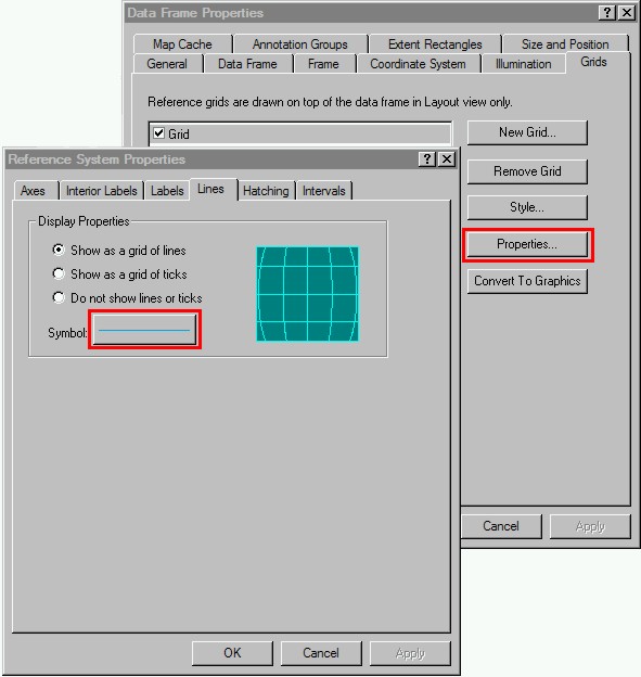
For the grid, under the Axes and Labels tabs in the Reference System Properties make all the lines, accept the meridians and parallels, invisible and make the labels invisible as well (change their color to "No Color" in the color symbology window).

The default map layout has some stuff in the margins (this is generally referred to as the "collar" of the map). Get rid of everything but what is shown in the screenshot below. The projection will serve as a title (make it's font size larger, > 20), add the data source and a legend key for cities.

Please, if you need help with this ask for it. I've already mention that ArcMap is not graphic design software, although it tries to be. Getting used to this can be frustrating. You will need to convert the legend to a graphic so you can Ungroup and edit the individual parts (the text box, size, position, font size/style, etc.)

Set the scale in Layout View to 1:125,000,000, and then Insert a text scale (Insert -> Scale Text ..., choose Absolute Scale) as shown in the screenshot below.

Add the tissot shapefile from the projection_lab_data folder. Change the symbolization so they are light gray.

Question
3. What do the
Tissot's indicatrix tell you about this projection? Is it conformal, equidistant, or ...? Explain the main difference between conformal, equidistant and compromise projections. Refer to the websites at the beginning of the lab, or lecture.

In ArcMap go up to File -> Map Properties, click the Data Source Options button and set it to "Store relative path names". Save the ArcMap layout as "Mollweide" in the projection_lab folder, after you have saved the map layout (and set ArcMap to "Store relative path names") export a 110 dpi jpg.

Attach both the mollweide.mxd file and the .jpg to an email and send it to yourself (or copy these two files to your USBThumbdrive).


Part 2.2 - Make a map of North and South America

Open a new ArcMap Layout and, in ArcCatalog, connect to the TemplateData folder (C:\Program Files\ArcGIS\Bin\TemplateData\World\). I would like you to add the Cntry00 and City shapefiles from the TemplateData folder to an empty map layout, if you've connected to the TemplateData folder you can just drag-and-drop from ArcCatalog to ArcMap.

The orthographic family of projections make for good visualizations of small scale maps because they displays features (continents, ocean currents, etc.) on a sphere, or at least what appears to be a sphere. This is a popular way of showing a portion of the globe. ESRI has two of this family, the "Vertical Perspective" (which is Equatorial) and "Earth from Space" (which is Oblique). Both of these are similar, you could just as easily do the following steps with either projection.

Step 2.1.1 - Set the Coordinate System to Vertical Perspective

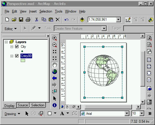
Go up to View -> Data Frame Properties, click on the Coordinate System tab. Go to Predefined -> Projected Coordinate Systems -> World, select Vertical Perspective (world). Click Apply and OK. What you get should look like the screenshot below.

You need to Modify the Data Frame's Coordinate System so that the projection's Longitude origin falls though North and South America, and set the Latitude of origin so that at little more of the Northern Hemisphere is displayed (so the map is more balanced). To do this go back up to View -> Data Frame Properties. Click Modify ..., in this window you can type in a Longitude_Of_Center and Latitude_Of_Center value (or change the distance from the surface, Height). You will need to figure out what these two values are for yourself (search ArcGIS Desktop Help for "longitude").

Question
4. What did you have to change it to so that North and South America are roughly positioned in the center of the map?
From the ArcGIS Desktop Help on longitude what projection is mention as being 'basically the same" (the planar equivalent) of GCS?

Step 2.2.2 - Use a Query to change the display so only points and polygons in N/S America are visible

Next modify the Symbology for the City shapefile so that only cities with greater than three million people are displayed, also modify the Cntry00 shapefile so that only North/South America and the Caribbean are displayed. To do this open the Symbology for each layer, and under the Definition Query tab use the Query Builder to construct a query for population greater than three million and continent (FIRST_CONT) is North America or South America. Note: you will need to use a separate set of brackets for the compound OR condition.

What you have after doing the queries to modify the displayed features should look something like the screenshot below.

Save this map with an appropriate name (Perspective), and don't forget to set the Data Source Options.

Step 2.2.3 - Add a Graticule

Switch to Layout View and add a 15x15 degree graticule (View -> Data Frame Properties, Grid). A simple grid will suffice, after you click the New Grid button, in the second dialog window uncheck both Major and Minor tics and make the text labels invisible.

After you have added the graticule, and you have the features correctly displayed, you should have something like the following.

Question
5. You used 15 degrees and there is half of a sphere visible.
How many meridians are visible in the graticule you just added to the map? Is there more or less than there should be?

Step 2.2.4 - Add labels and other text to the final map

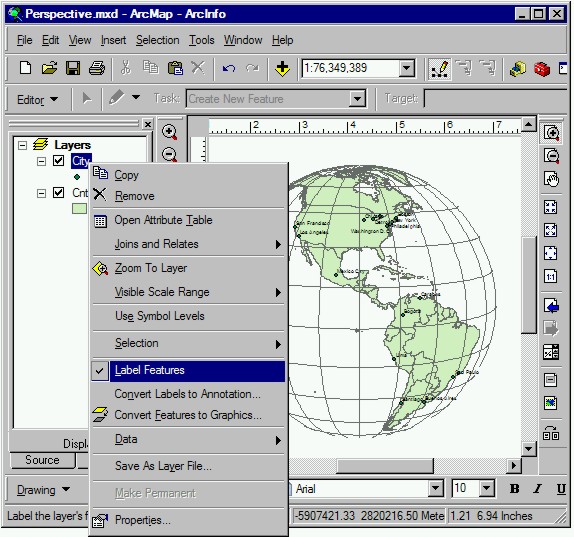
Turn on labels for the cities, right-click on the City shapefile and check on Label Features. Below is a screenshot similar to what you should see.

Next open the Layer Properties dialog for the City shapefile, and go to the Labels tab. Change the label properties until you are satisfied with how they appear. You can change just about everything, experiment with different buttons to see what they do. Sometimes ArcMap will not redraw correctly, you have to click the refresh button a few times before it will show-up.

Add an appropriate title and footer information; projection name, parameters (optional), data source, a legend for cities, and created by (and the date).

After you have sufficiently frustrated yourself with ArcMap's clunky graphic editing mode, save the final version (set ArcMap to "Store relative path names"). Export a 110 dpi jpg, attach the .mxd file and the .jpg to an email and email it to yourself (or save a copy of these two files to your USBThumbdrive).

Part 2.3 - Make Your Own Map

Now you have your Cartographic "Learner's Permit", I would like you to make your own map. The only real requirements are that it be global scale and illustrate a particular projection (your choice). I think this will be your first chance to make a real map, your first map. Although there are a few requirements, feel free to experiment with colors, fonts, line styles, whatever. The goal is to develop your sense of what looks good to you, what you like.

To start I would like you spend some time browsing the Geography Network. The idea is to find a topic/theme that is interesting to you to make a map of something.

Step 2.3.1 - Connect to the Geography Network with ArcCatalog

In ArcCatalog connect to GIS Servers -> Geography Network -> ESRI_Quake_Rec_FS (might take a few seconds, depending on bandwidth usage and the server's load, but since this is a weekend maybe things will go fast).

Once you have connected to the server, look at the Contents tab of ESRI_Quake_Rec_FS. Select one of the available layers, and look at the Preview. Use the Identify tool to get an idea of what attributes are linked to the features.

In ArcMap create a new empty layout. Click the Add Data button, add the ESRI_Quake_Rec_FS group layer (ArcIMS Feature Service).

Step 2.3.2 - What is expected of your first map

After the group layer has been added to ArcMap it should look like the following (with the unlinked layers removed, cities with more than 5 million and country polygons).

Now you make a global scale map from this or some other data source from the Geography Network. It should show a continent or global region so that your choice of projection is apparent, your final map must have all the appropriate information, title, legend, projection, data sources, scale, name, date, etc. For the example show above I did not use a projection (it's just latitude-longitude, which isn't really a projection) and there is no graticule or anything. Your map will have these things, and a few more things.

Feel free to use a Template map layout (like you did for Part 2.1) or start from a empty layout, use any of the Geography Network data you find interesting. Some servers may be dog slow, if you find it taking more than a minute to load-refresh you might consider something else. ESRI's Geography Network stuff is usually fast, but feel free to experiment with others (i.e. USGS). The Tsunami data are a good example of global scale, or you could just stick with earthquakes, it's up to you.

Question
6. Describe the Geography Network dataset/server you chose to use for your map; What is it about these data that interests you? For the description start by looking in ArcCatalog, try to learn about the data; who maintains it?, what does it show? (attributes, themes, etc.), when was it last updated? You can be as detailed as you think necessary to support you map.

As before, save the map layout with an appropriate name, export a 110 dpi jpg and save a copy on your USBThumbdrive or email the jpg and .mxd file to yourself.

Part 2.4 - Deliverables for Lab 2.2

You are to email me, attached to one email, your 3 jpgs files for the three parts of this lab (Mollweide. Perspective, Your Own Map using the Geography Network), and the answers to for the Lab2.2 Write-up (with the jpgs inserted in the lab document).

Lab2.2_Projections_of_the_world.rtf
The End


created by jeff 4/16/05, last outdated 5/06